You Guys Deserved Better
This week on the PlayRated Podcast (WATCH HERE), we dove headfirst into a pixelated hellscape of design crimes — the cursed category of Good Games with Terrible Box Art. You know the ones: legendary games that look like someone’s 12-year-old nephew whipped up the cover in MS Paint.
We dragged a few offenders on the pod, but there was just too much ugly to fit into one episode. So here’s the extended cut — a mix of titles we couldn’t squeeze in, all of them iconic gameplay experiences wearing visual disasters that belong in a thrift store clearance bin. So buckle up, because we’re about to roast 12 games that play like GOATs but have the box they were packaged in look lousy.
Table of Contents
1. Mega Lame Box
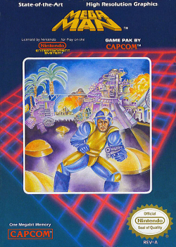
For a game that was released in the 1980s, this still looks AI Generated. When I posted the podcast on Reddit asking people to chime in some of their favorite games with bad box art – THIS was one that kept getting repeated in the comments. This cover looks like Mega Man got lemon juice squeezed in his eyes. The proportions are all wrong, the colors are violent, and nothing about this screams “classic platformer” — it screams “used car salesman with a laser gun.” This is considered one of the most infamous examples.
Note: Affiliate Disclosure: At PlayRatedGames, our content is made possible by our readers. If you purchase a game or product through links on our site, we may receive a small commission. This support helps us continue publishing honest, independent reviews. Our recommendations are based solely on what we believe offers real value to players — never influenced by affiliate partnerships.
2. No One’s Favorite Hero
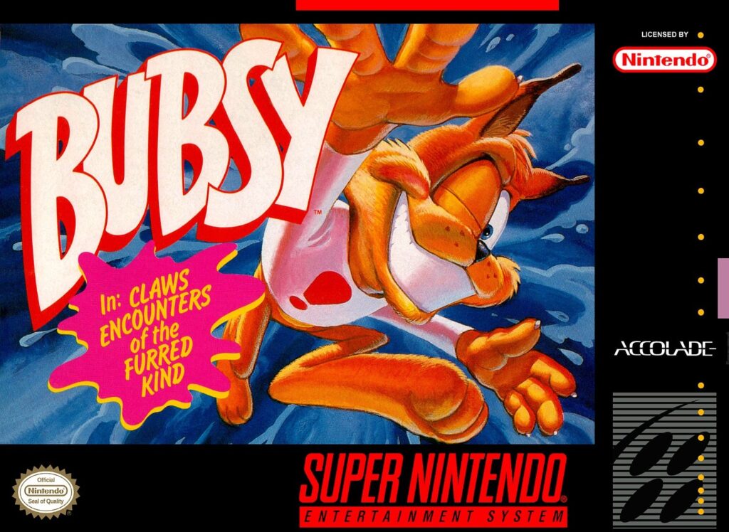
Bubsy is easily one of gamings most rejected mascots. This smug little furball had so much marketing hype — and somehow the cover looks like a rejected Looney Tunes pitch. Bubsy’s doing a weird jazz-hands fall while staring into your soul. It’s like someone yelled “attitude!” and the art guy freaked. I didn’t even realize how popular he was before Bubsy 3D… God help him.
3. Even the name kinda sucks…
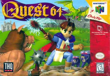
I’m gonna level with you all. I’m not even entirely sure what this is. Apparently it gets a lot of flak but has garnered a cult following from N64 enthusiasts such as myself. Doesn’t really seem my speed but regardless, I do rememeber seeing plenty of copies of this ugly thing in the bargain bin.
4. Ugly Game/Ugly Cover/Weirdly Captivating
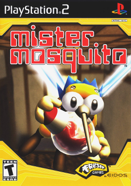
What this game lacks for in looks it sure makes up for in personality. Mister Mosquito’s box art is just so in your face, but then again, everything about this game is pretty fever dreamy. That’s kind of the energy the game’s going for. You play as an actual mosquito, buzzing around a Japanese family’s home, trying to stealth-suck blood without getting swatted to hell. The whole concept feels like it was dreamt up during a NyQuil-fueled nap, and the cover matches that tone perfectly. It’s absurd, it’s awkward, and somehow… it totally fits. I also really appreciated how this game got a shoutout in Astro Bot! (BUY ASTRO BOT GAME HERE)
5. Another Strange Title
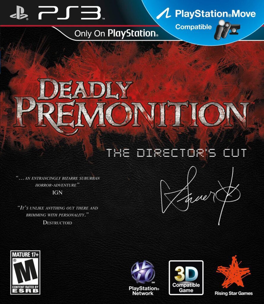
Another strange title with an even stranger upgrade. I actually think the original Deadly Premonition box art was fine—it matched the game’s weird charm. But this Director’s Cut looks like someone slapped it together in two minutes on Canvas and shipped. NOTHING about this cover art has even a crumb of originality.
6. Yeah this One’s Lame Too
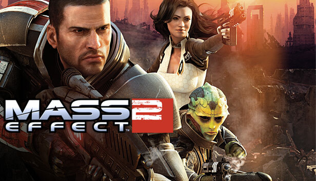
I know we shredded Mass Effect 3’s art to ribbons during the podcast episode, but on second thought, yeah- Mass Effect 2’s box art sucks too. It’s actually worse than 3s I think. GREAT game obviously – many consider it the best in the trilogy – but c’mon… The cover was always bad. I think the first games cover might be the only good one in the series.
7. Serious Old Man Face
With these later entries—like Uncharted 4 we mentioned on the podcast—they take an already legendary character and slap a rugged, tired “been through it all” version of him on the cover. It feels almost pretentious, like the art is saying, “His best days are behind him now… this is the final hoorah.” Come on, guys! If you want us hyped, don’t show us the worn-out veteran ready to hang up his boots. Show us the adventure, the fire, the reasons we fell in love with the character in the first place. Instead, we get a cover that’s more “end of an era sigh” than “let’s go, legend!”
8. Iconic Series from Humble Beginnings
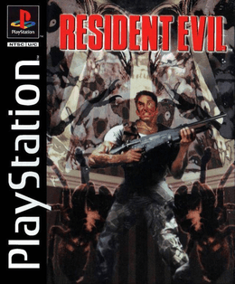
Truthfully, I don’t think its all that bad, but it’s another case of “guy with gun” that we mentioned and nothing else interesting to look at. No one wants to look at gross spiders! Why not just do a cool wallpaper of the mansion with a creepy night sky? I’m sure for marketing and assured sales they needed the “guy with gun” Chris Redfield but man.. this one, as iconic as it is, is bad.
9. It Looks Fake
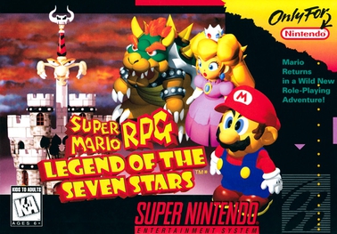
This game was around when I was a kid just getting into gaming, yet I never knew about it. Maybe I caught a glimpse of the box once and wrote it off as some bootleg knockoff of the real Mario. Honestly, everything about this cover screams “fake” — like it was slapped together in five minutes. The font’s off, the characters look downright atrocious, and nothing matches. And the kicker? Even the remaster somehow replicated this hot mess. Why?! It’s like they said, “Hey, let’s take the one thing holding this masterpiece back — its box art — and give it a fresh coat of garbage.”
10. I Mean, The Castle’s Cool I Guess…

I don’t think any game in this series can or ever will top Symphony of the Night, but many still seem to try. Lots of games in this series are beloved, and many have iconic covers. This game is definitely one of those beloved titles — but man, that cover sucks. It’s really bad. Why is the dude even holding his hand out like that? All of these characters look like they came from different animes from slightly different eras and were just plastered together.
11. GOTY Edition – WE GET IT
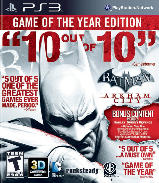
You triple-A developers need to stop getting cocky. This game’s hailed as one of the greatest of all time — deservedly so. Game of the Year material, no doubt! But seriously, we know already. Quit flexing. We get it. Even as a magazine cover, this is an assault on the eyes. Chill with the quotes of high praise. You’re known for top-notch art direction — so what’s the excuse for this mess?!
12. EA Sports Game Covers
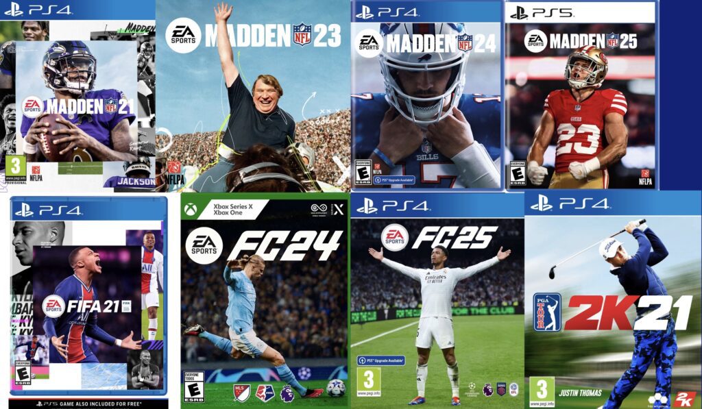
Not all of them, but I dare say most. EA Sports covers are about as exciting as eating cold pasta with no sauce. You get a helmet, a player staring blankly into the void, and a background that screams “generic stadium.” It’s like they figured they already have a majority of casuals on the hook annually, the box art doesn’t need to try. Subtlety is their middle name — which is unfortunate, because enthusiasm definitely isn’t.
Stick with us for more!
There’s no shortage of bad games with bad box art out there—but hey, let’s not get ahead of ourselves. That’s a whole other dumpster fire we’ll save for another day. For now, we’ve celebrated some seriously great games stuck with covers that missed the mark harder than a blindfolded dart thrower. So next time you judge a game by its box, remember: sometimes, the real treasure’s hidden beneath an ugly jacket. Stay tuned — the “bad games with bad covers” roast is coming soon, and trust me, it’s gonna be savage.
Watch/listen to the full podcast episode here below – remember to like/comment/subscribe 🙂 We’d really appreciate it!